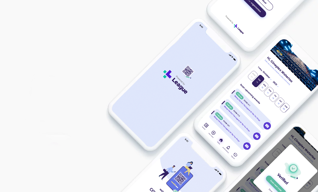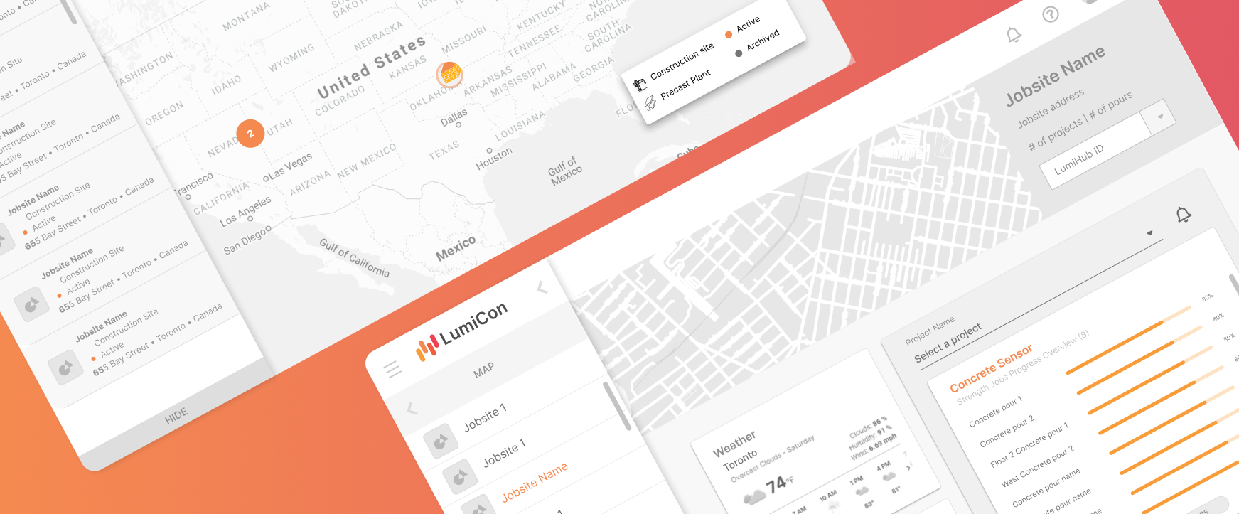
Introduction
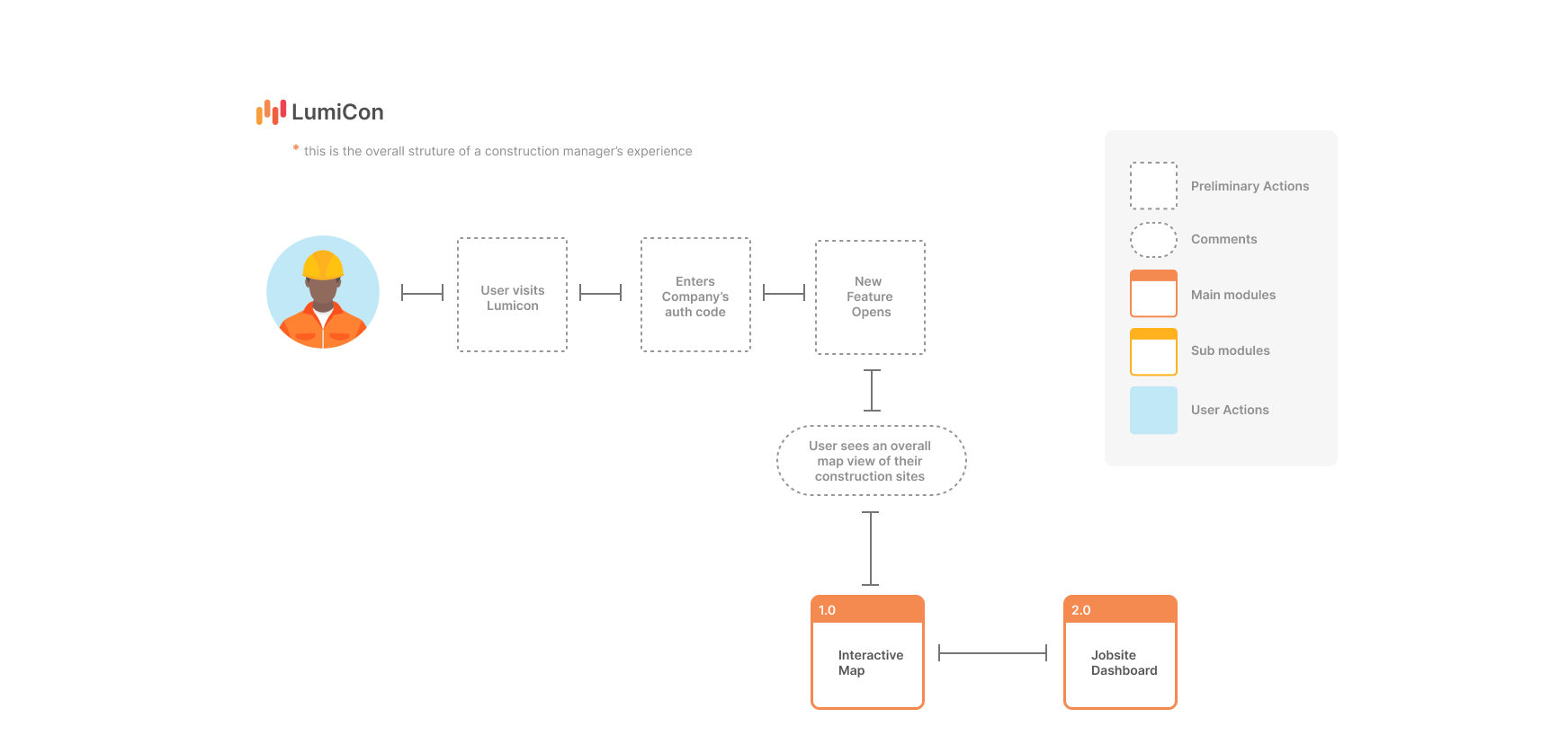
This project improved digital workplace of senior level construction leaders to easily navigate and view their on-site concrete pouring processes. The final design was an ambient display that provides construction managers a real time construction site, concrete sensors data as well as local location data. Enhancing more efficient work flow in managing construction jobsites virtually anytime.
My Role
As a product designer, my role involved user research, product ideation, visualization and crafting user flows. I helped develop the product's artefacts including wireframing, prototyping and navigating the project through the design thinking process. I also led and managed design discussions, iterations, and communications between my stakeholders and my team members.
Problems
This new feature began with on-going problems of AOMS clients while using our concrete sensor products. From preliminary research, we learned that a dashboard is necessary to provide users an overall view of their job sites.

User Research
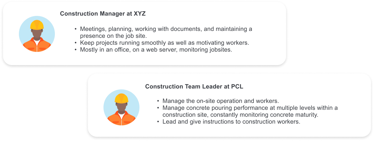
In the beginning phases, we held meetings with the customer facing teams to understand more about the specific target user- Senior level construction leaders/ managers. After holding meetings with Marketing and Customer success teams, I analyzed the users based on the meeting results into user personas.
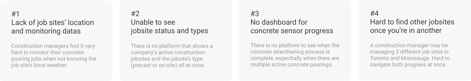
Key Findings
After initial meetings with the customer facing teams, I collected many insights and user informations on the construction industry and concrete pouring workflows. Using the meeting results, I collected key findings and organized them into 4 categories. These notes later became the design constraints when we start ideating the platform interface.
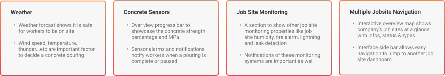
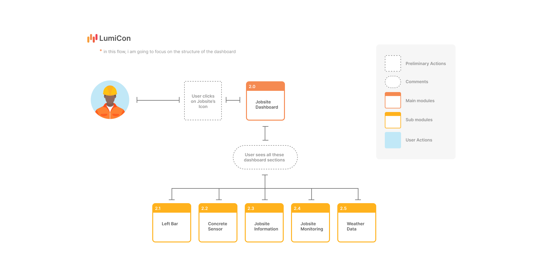
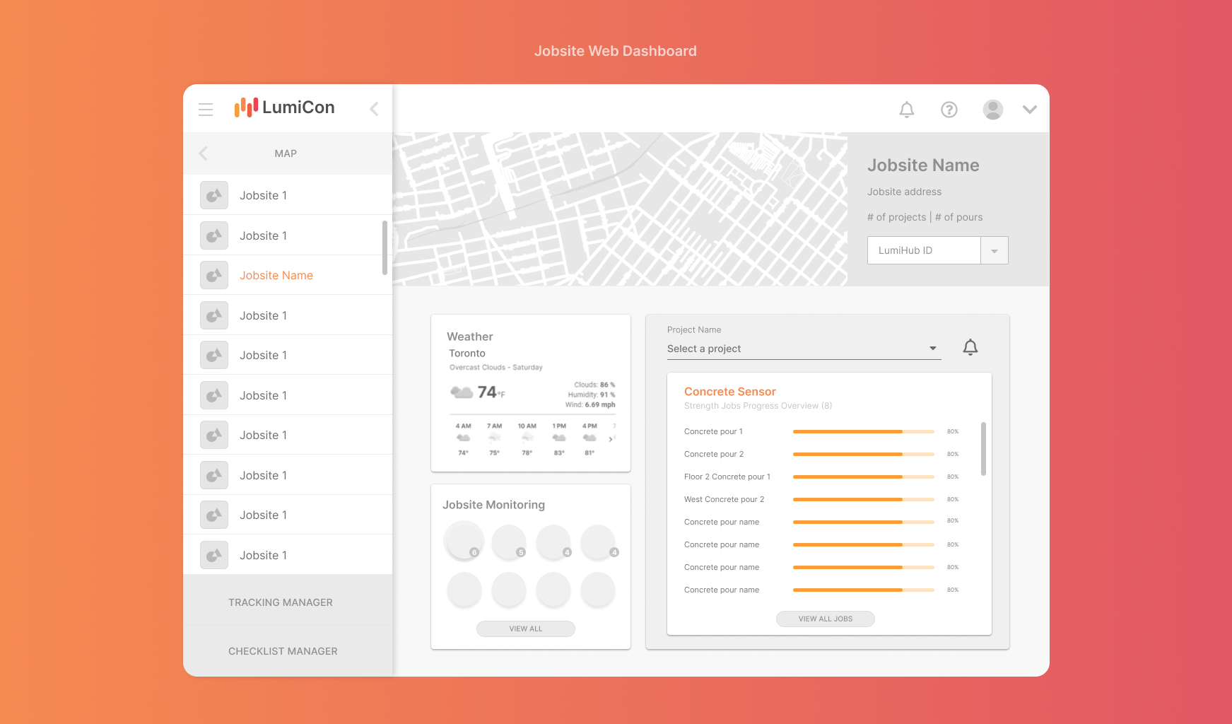
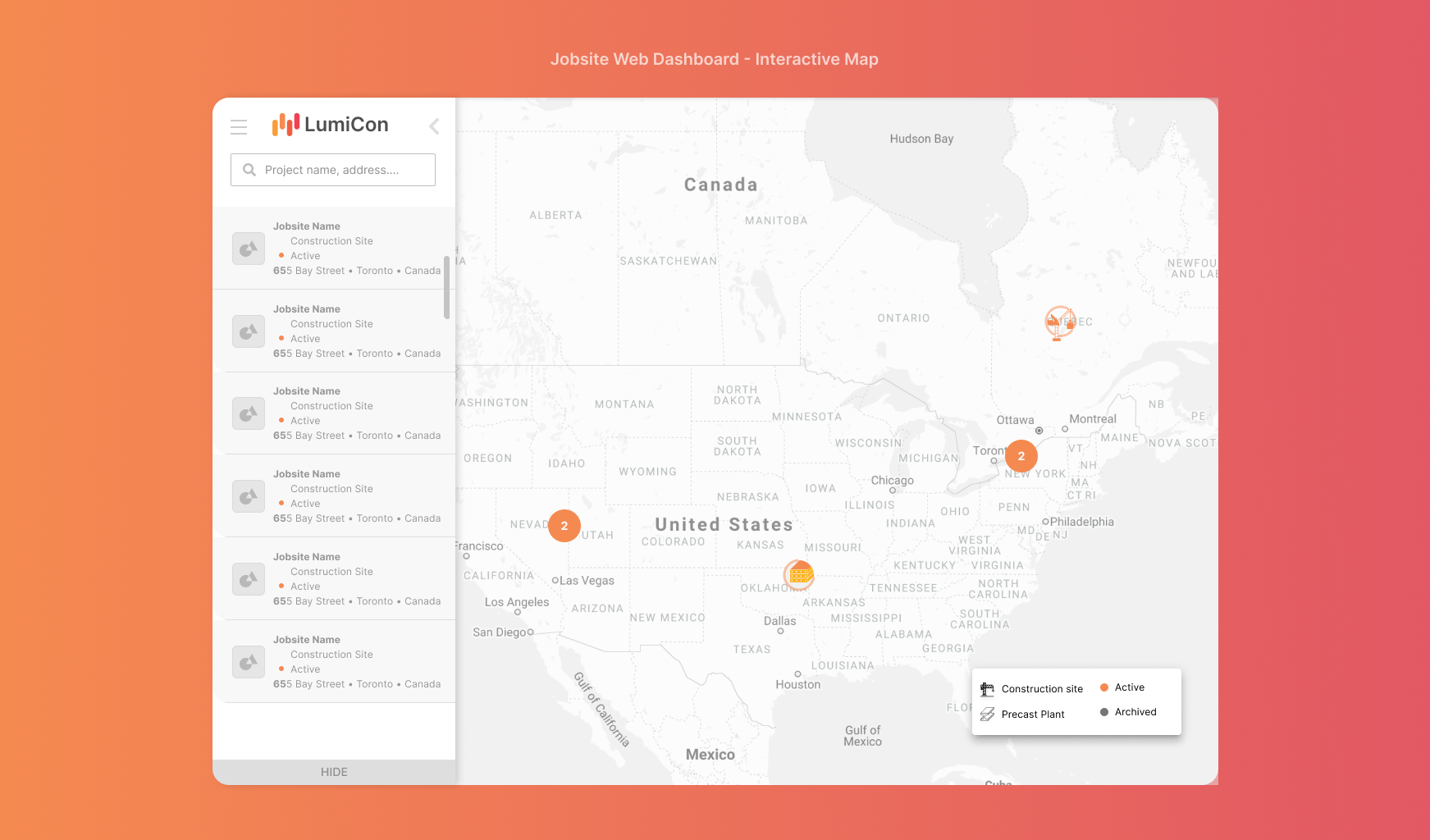
What are the main features?
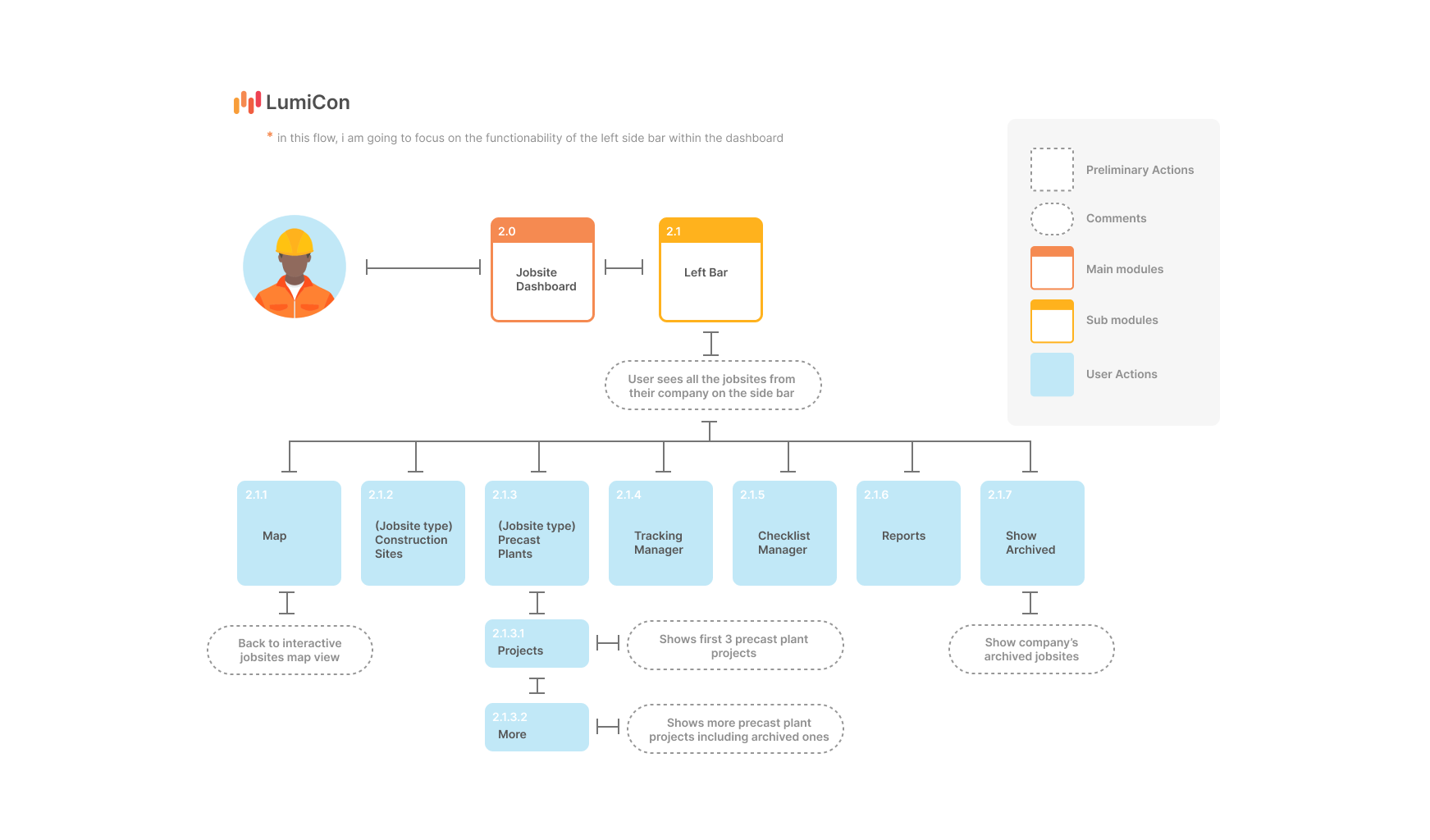
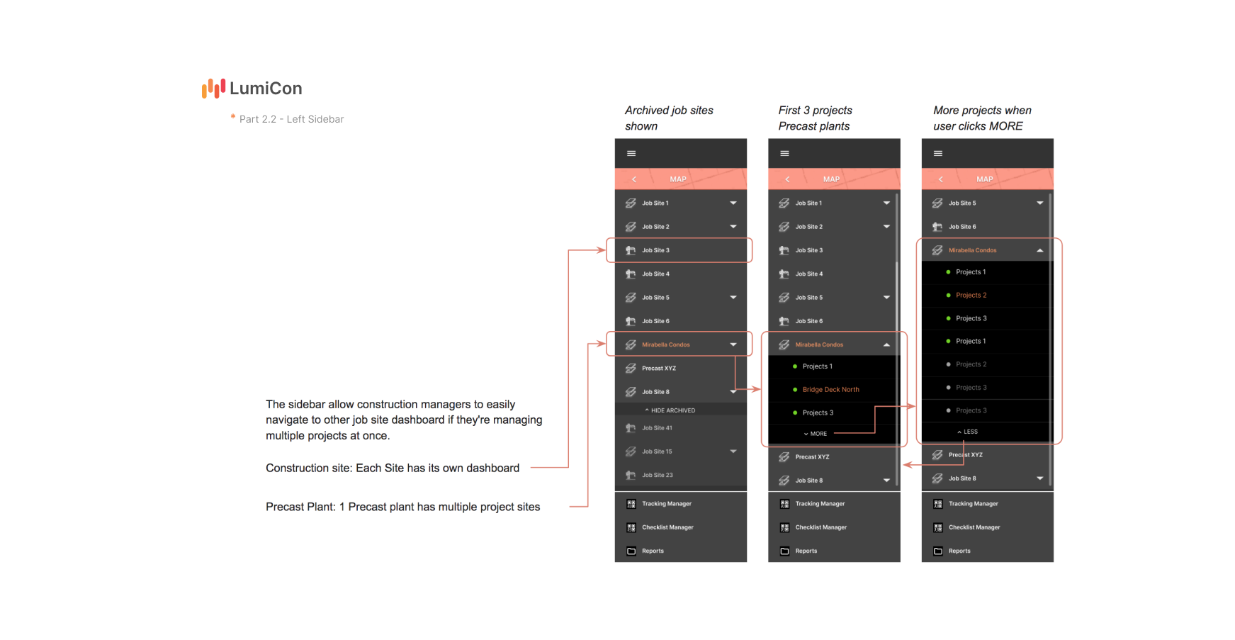
1. A sidebar (contains other jobsite status & type)
2. Weather information
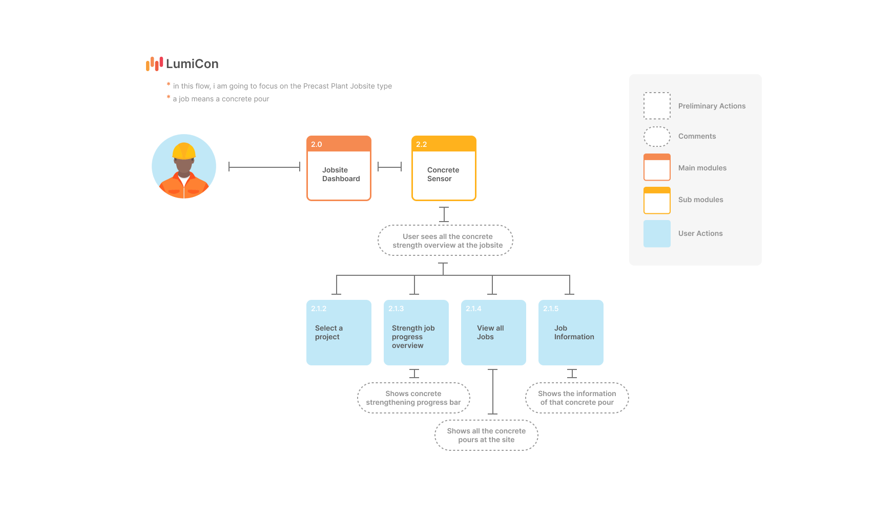
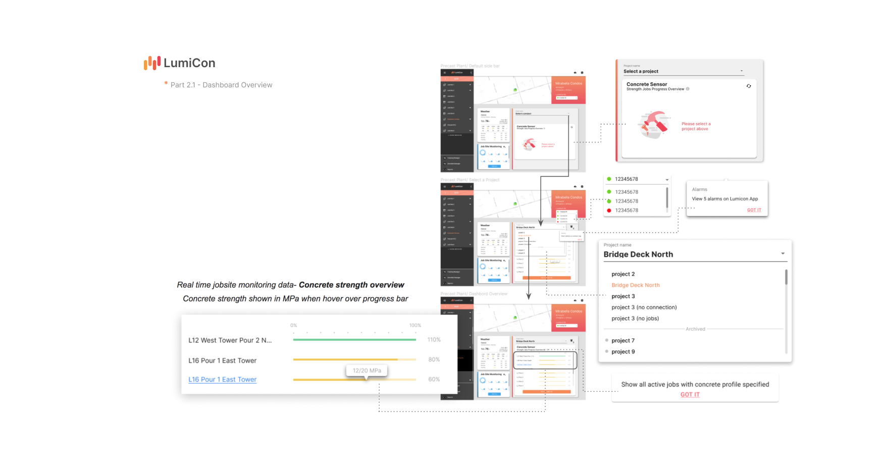
3. Concrete sensor progress overview
4. Other jobsite monitoring devices section
Ideation
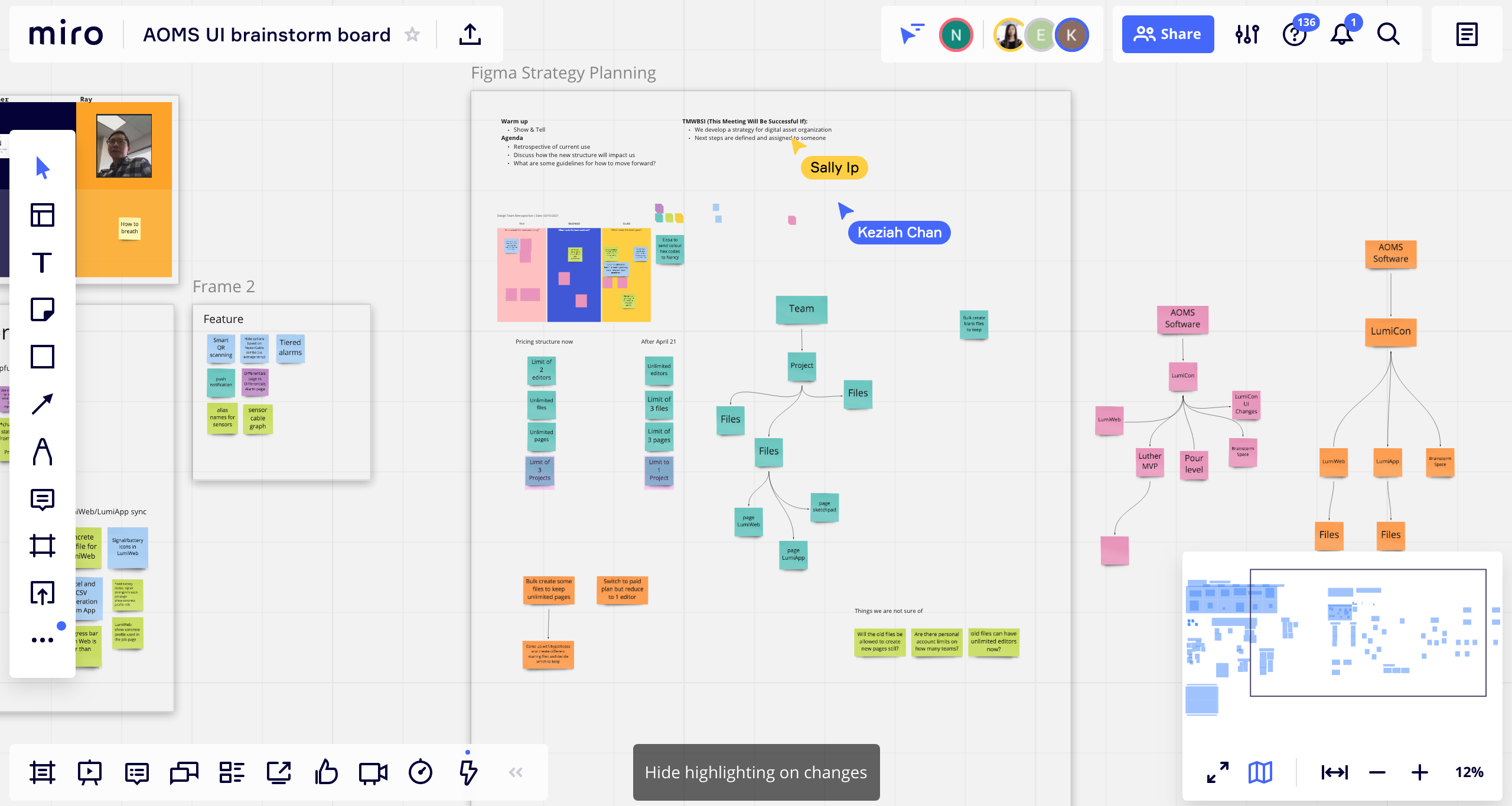
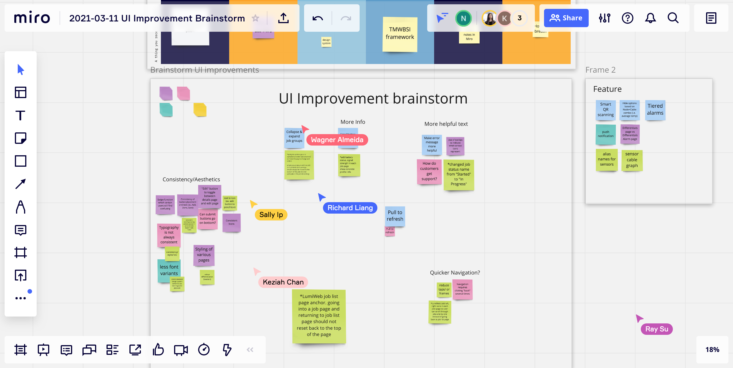
Brainstorming
Our marketing and design team started strategy planning on major flows that needed to be included in this new ‘Jobsite Dashboard’ feature. A software analyst also joined in this meeting to give us development constraints and possibilities, since it is a completely new feature. I held design charrettes on this interface by using the method of affinity diagramming. It is a method that helps design, marketing, and customer success teams collaboratively analyze ideas and research findings. We organized facts and comments into distinct clusters by placing coloured sticky notes together (each color represents a person).

Conclusions
Reflection
Think beyond the experience including the idea’s usefulness, desirability and practicality. When we were working with other teams (development and marketing), it may have too many (technical, structural, organizational or financial) difficulties to implement.
What I would do differently
Brainstorm more diverse ideas before narrowing down the scope/solutions. Challenge ourselves to think of more design alternatives. Explore ideas that didn't be selected because of the technical and financial capabilities.
Key takeaway
MVP user flows are important when designing a product with limited time. Often times designer tend to have a lot of ideas and flows in their head, but in order to collaborate with the engineers, we need to understand what is the most important features and the main structure of a product!on the user experience.
-Finish-